Designing promotional materials for your own performance is an intensely personal yet strategically vital process. It’s where art meets advertisement, and your creative vision must translate into something that not only represents you authentically but also compels an audience to buy a ticket and invest in your experience. This isn't about slapping a date on a picture; it's about building a visual world that your show inhabits, a world so intriguing that people want to step inside.
The journey begins long before you open design software. It starts with introspection. You must distill the very essence of your performance into a core concept. What is the emotional heartbeat of your show? Is it a melancholic acoustic set, a high-energy electronic dance party, a thought-provoking theatrical piece, or a stand-up comedy routine dripping with satire? This core feeling, this narrative, becomes the north star for every design decision you will make. It informs the color palette, the typography, the imagery, and the overall tone. If your music is ethereal and dreamy, a stark, bold, and aggressive poster would create a confusing dissonance for your potential audience. Authenticity is your greatest currency here.
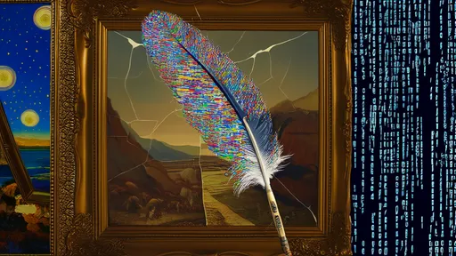
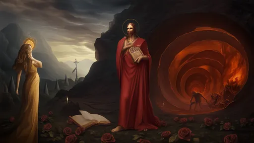
With your concept solidified, the visual development can commence. Imagery is paramount. Will you use a powerful photograph, an evocative illustration, or perhaps clever typography that stands alone? A photograph offers immediacy and a human connection. A well-shot portrait, perhaps with interesting lighting or a candid expression, can convey volumes about the mood of the performance. Illustration, on the other hand, allows for limitless creativity and the construction of entirely unique worlds that defy photography. It can be whimsical, dark, abstract, or hyper-realistic, offering a different pathway into the tone of your event. Whichever route you choose, the image must be high-resolution and work effectively at various sizes, from a large poster to a tiny social media avatar.
Typography is not merely about displaying information; it is a voice. The font you select speaks before a single word is read. A delicate script whispers elegance and intimacy, while a rugged, blocky typeface shouts strength and urgency. The key is legibility; no matter how artistic your font choice, if people can't quickly discern who you are, where you're playing, and when, the design has failed. Hierarchy is the companion to legibility. The most important element—usually your name or the show title—should command attention first, followed by the date, the venue, and then any supporting information. This visual guidance ensures the audience absorbs the critical details in the correct order.
Color psychology is a silent yet powerful tool in your arsenal. Colors evoke specific feelings and cultural associations. The deep blues and purples of a jazz club poster suggest sophistication and late-night vibes, while the neon pinks and yellows for a festival scream energy and fun. Your chosen palette must resonate with the emotional core of your performance. Consistency across all materials is crucial; this color set becomes part of your visual identity for this event, creating a cohesive and professional look that builds recognition.
Now, let's talk about the all-important information architecture. The fundamental purpose of any poster or flyer is to communicate essential details. This includes the name of the performer or show, the date, the venue, the time, and how to acquire tickets. Omitting any of these is a critical error. In today's digital age, including a QR code that links directly to your ticket sales page is no longer a fancy addition—it's a necessity. It removes friction between a potential fan's moment of interest and the point of purchase, seamlessly connecting your physical promotional material to your digital storefront.
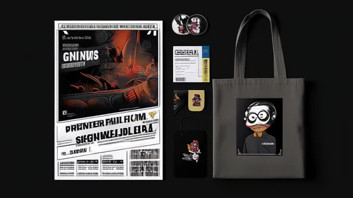
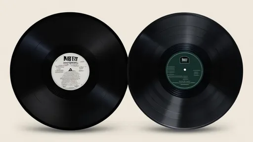
Once your poster is designed, you have the blueprint for your entire merchandise ecosystem. Your merch—t-shirts, tote bags, pins, vinyl sleeves—is not just a revenue stream; it's mobile advertising and a tangible keepsake for your fans. It extends the life and reach of your performance long after the final curtain call. The best merchandise feels like a natural extension of the show itself, not an afterthought. The visual language you established for your poster should carry over directly onto your merch. That striking central graphic from your poster? It’s now the centerpiece of a t-shirt. The custom logo-type of your show name? It becomes a beautifully embroidered patch or a sleek pin.
When producing merchandise, quality is non-negotiable. A cheap, thin t-shirt that shrinks and fades after one wash reflects poorly on you and your brand. It tells your fan that your art, and by extension their support, wasn't worth a quality product. Investing in good blanks—comfortable, well-fitting garments—and reliable printing methods (like screen printing for larger runs or higher-quality DTG for detailed designs) makes all the difference. Your merch should be something your fans are proud to wear, effectively making them walking billboards for your work.
Finally, think strategically about your rollout. Don't reveal all your cards at once. Tease the poster design on social media to build anticipation. Then, do a full reveal of the poster, driving traffic to ticket links. As the event approaches, unveil your merchandise line-up, perhaps even offering pre-orders to gauge interest and manage inventory. After the show, continue to sell the merch online; it becomes a collector's item for those who attended and a way for those who missed it to connect with the event. Every step is an opportunity to re-engage your audience and build excitement.
In conclusion, designing for your own演出 is a profound exercise in personal branding and artistic communication. It demands a clear vision, a thoughtful approach to visual elements, and a steadfast commitment to quality and consistency. By weaving the core narrative of your performance through every aspect of your poster and merchandise, you create more than just promotional items; you create a cohesive and immersive experience that begins the moment a person lays eyes on your design and continues long after the applause has faded. It’s your story, told visually. Make it count.
By /Aug 22, 2025
By /Aug 22, 2025
By /Aug 22, 2025
By /Aug 22, 2025
By /Aug 22, 2025
By /Aug 22, 2025
By /Aug 22, 2025
By /Aug 22, 2025

By /Aug 22, 2025
By /Aug 22, 2025

By /Aug 22, 2025
By /Aug 22, 2025
By /Aug 22, 2025

By /Aug 22, 2025
By /Aug 22, 2025

By /Aug 22, 2025
By /Aug 22, 2025
By /Aug 22, 2025
By /Aug 22, 2025

By /Aug 22, 2025